
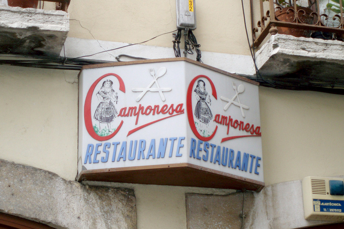
Former Logo
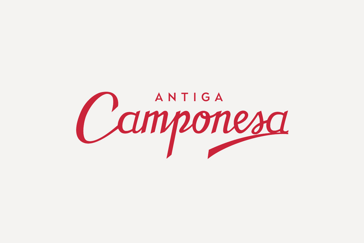
Logo Redesign
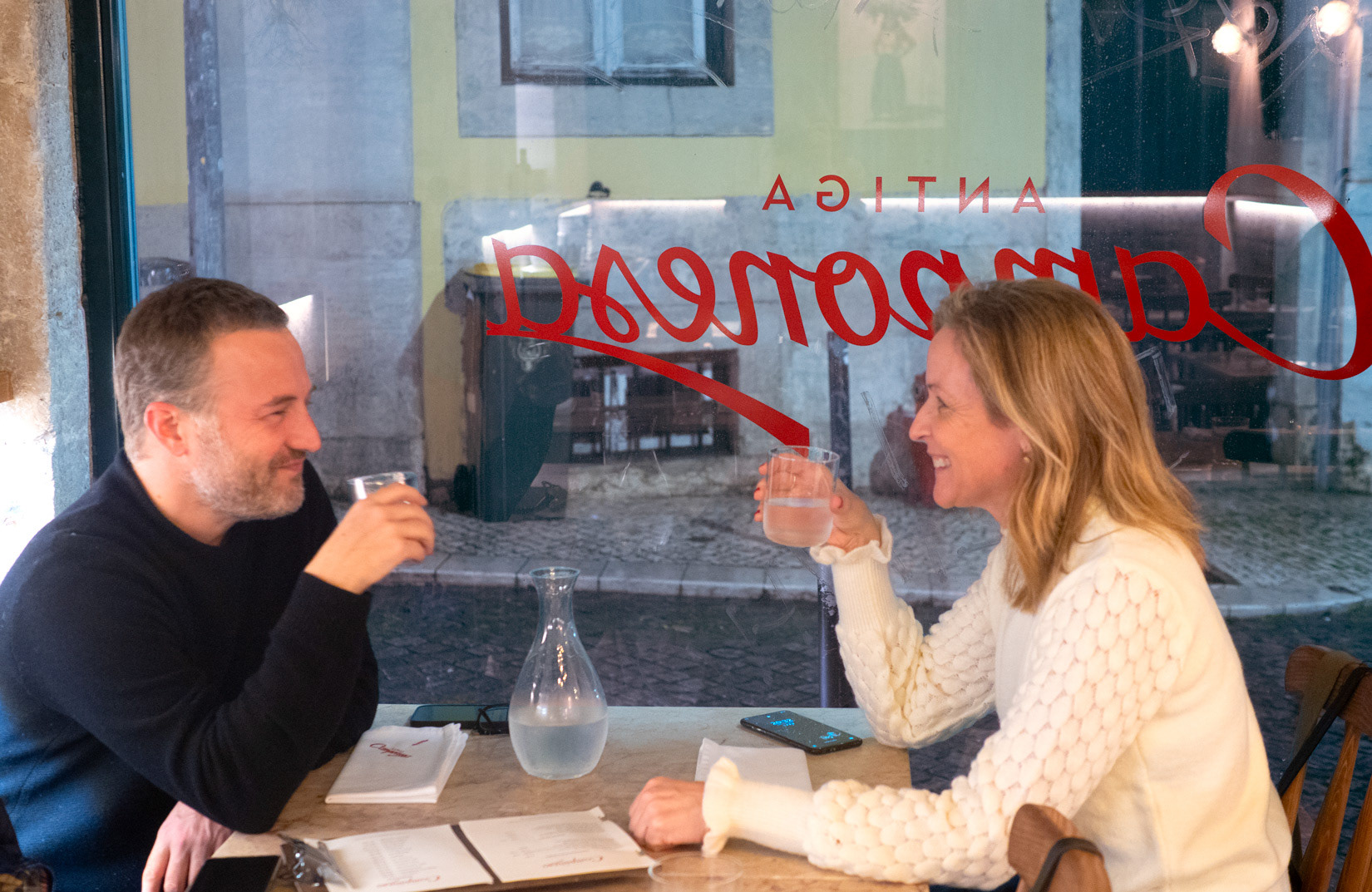
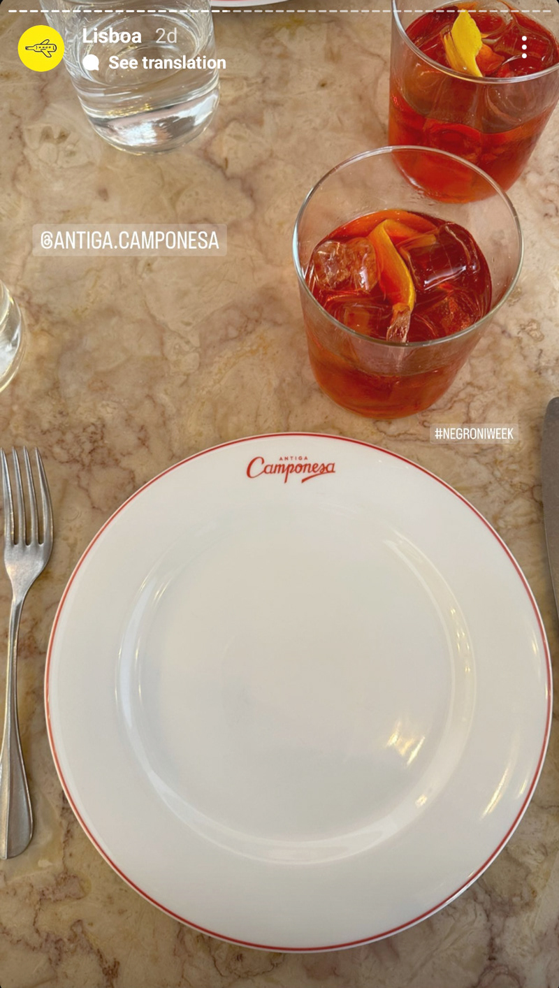
While starting a new restaurant business in the former home of an older restaurant the client wished to maintain in essence the name and feeling of the logo as the type of cuisine served would be Contemporary cuisine rooted in Portuguese traditional cooking.
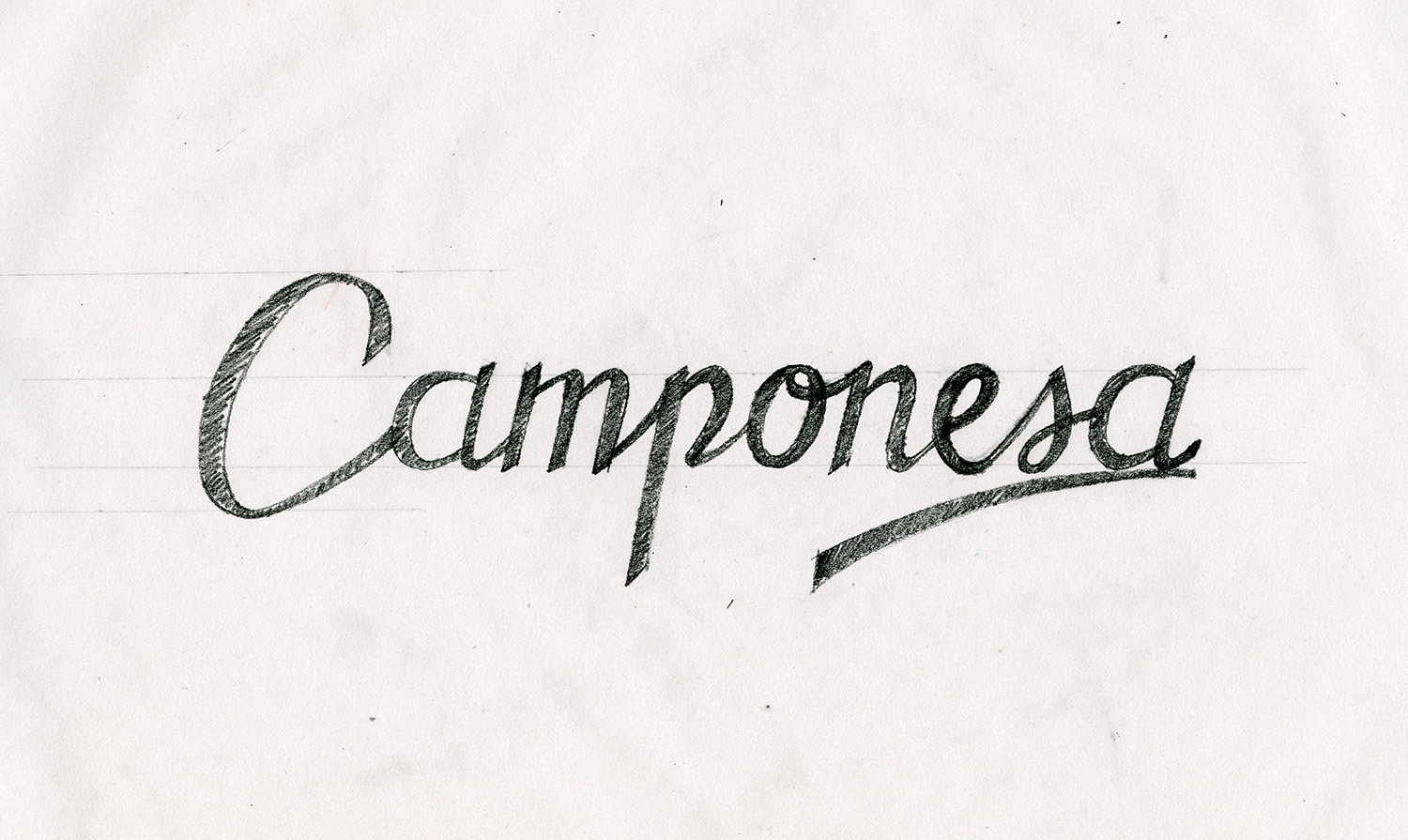
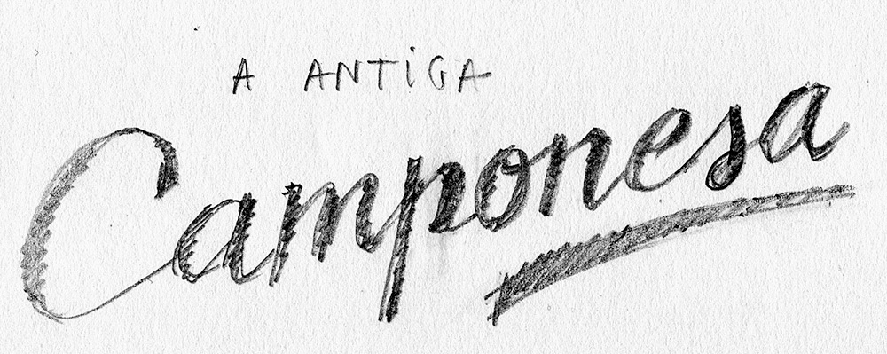
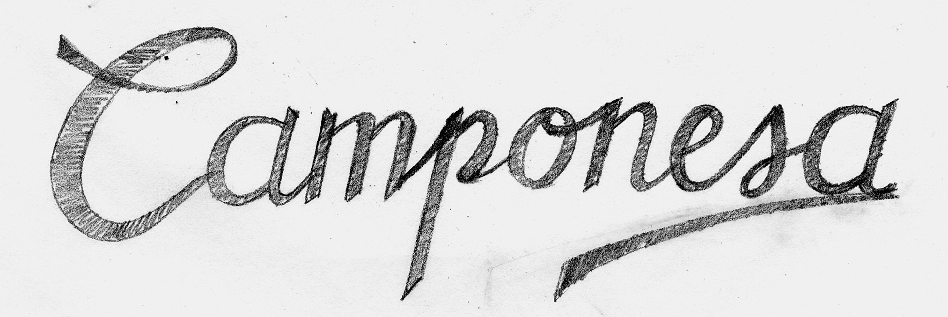
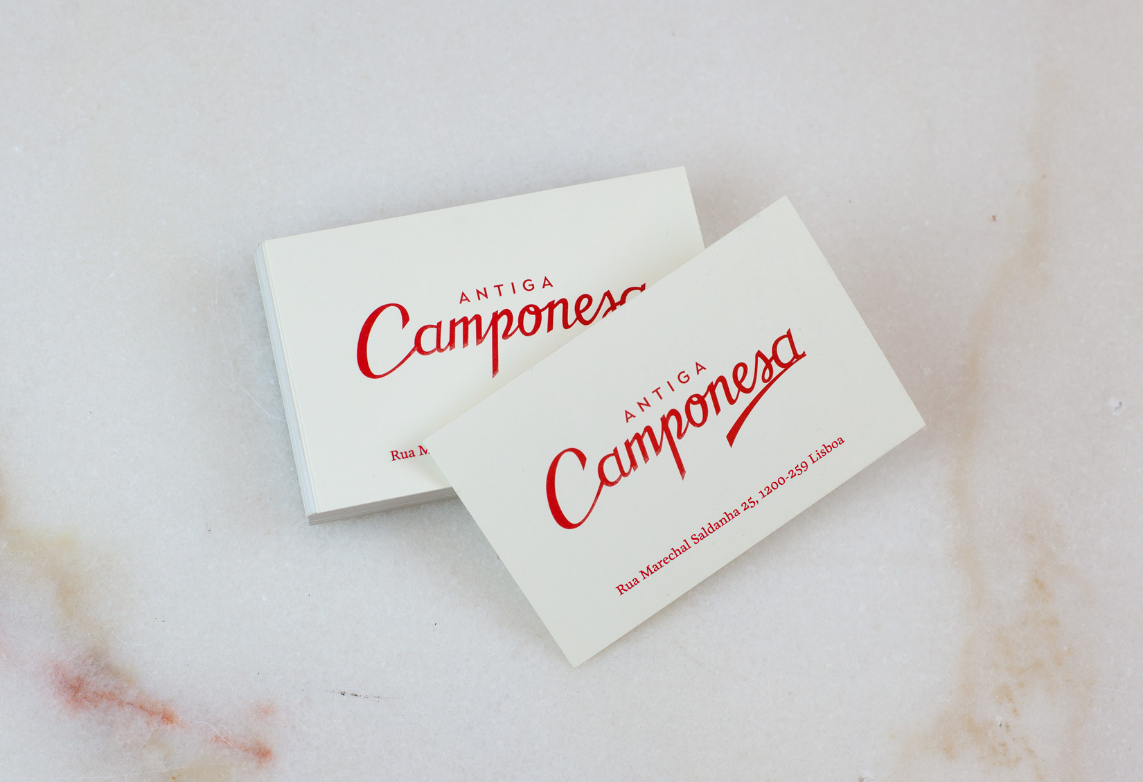
The main premises of the redesign were to drop the "A" from a "A Camponesa" (The Peasant) and add "Antiga" to the name ([the] Old Peasant), remove the illustration altogether from the logo and keep the hand calligraphy style of the logo.

Some of the aspects taken into consideration in the Redesign:
Improving letter transitions, reshaping the "p" to improve legibility, open up characters to add 'breathing' space
Improving letter transitions, reshaping the "p" to improve legibility, open up characters to add 'breathing' space

Balance overall weight

Improve readability in small sizes

Colour: Keeping in with the existing colour, a bright shade of red was selected for the new logo